Think about the last time you walked into an unfamiliar building. A hospital, an airport, maybe a university campus. You probably glanced at a directory, spotted a sign or two, and figured out where to go within a minute. Now imagine doing the same thing without being able to see any of it.
That is the daily reality for millions of people. According to the World Health Organization, at least 2.2 billion people around the world live with some form of vision impairment. For many of them, the real challenge is not walking itself. It is knowing what is around them, where the exits are, and how one space connects to another.
This is exactly where tactile maps step in. They are simple in concept, but they can change how independently a person moves through the world. In this article, I want to walk you through what tactile maps are, how they work, where they matter most, and what to keep in mind if you are planning one for your own building or organisation.
What Is a Tactile Map?
A tactile map is a map you can read with your fingers. Instead of relying on colour and printed labels, it uses raised lines, different textures, shapes and Braille to show the layout of a place.
A thick raised line might be a corridor. A dotted line might be a path or a boundary. A small rough square could mark a staircase, while a smooth circle could show a lift. Braille labels, and often large high-contrast print as well, tell the reader what each symbol means.
You can find tactile maps in all sorts of formats. Some are printed on special paper that puffs up when heated. Some are embossed on metal or plastic plates and fixed to walls. Others are 3D-printed models of entire buildings or neighbourhoods. The idea behind all of them is the same: turn visual information into something you can feel.
Why a tactile map is not just a "normal map with Braille"
This is a mistake I see quite often. People take a regular floor plan, slap some Braille labels on it, and call it accessible. Unfortunately, that rarely works.
A standard map is packed with detail, because eyes can scan hundreds of items at once. Fingers can't. Touch is slower and more sequential, so a good tactile map has to be simplified on purpose. Fewer symbols, cleaner lines, more space between elements. The designer has to decide what really matters and leave the rest out.
A Quick Look at How Tactile Maps Came About
Touch-based maps are not a new idea. Educators for the blind were experimenting with raised-line drawings and carved wooden maps as far back as the 1800s, mostly for teaching geography in schools. For a long time they were handmade, which meant they were slow to produce and expensive.
Things began to shift in the second half of the twentieth century. Thermoform plastic, then swell paper, then digital embossing and eventually 3D printing made it much easier to produce accurate maps in decent numbers. Today, a designer can take a CAD floor plan, simplify it in software and have a finished tactile map ready in a few days.
Why Tactile Maps Matter for People with Visual Impairment
Let's be honest about something. Many public spaces were designed by people who can see, for people who can see. Even when a building has Braille signs on the doors, those signs only help once you have already found the door.
What a tactile map offers is something bigger: a mental picture of the whole space before you start moving through it.
It builds independence and confidence
When someone can explore a map with their hands and understand the layout in advance, they don't have to ask a stranger for help at every corner. They can plan a route, remember landmarks and travel with far less stress. A lot of blind and low-vision people say that the freedom to move without depending on others is worth more than any gadget.
It supports safer travel
Knowing where the stairs, ramps, crossings and hazards are lowers the risk of accidents. Knowing where the nearest exit is can matter even more in an emergency, and I will come back to that shortly.
It is useful for more people than you might think
Tactile maps are designed for blind and low-vision users, but others benefit too. People with cognitive differences, older adults who are losing their sight gradually, and even sighted visitors in a dark or smoke-filled space can find them handy. Good accessibility design tends to work like that. It helps the person it was built for, and quietly helps everyone else.
Where You Will Find Tactile Maps in Real Life
Once you start looking, you notice them in more places than you would expect.
Public transport hubs
Metro stations, railway terminals and airports are confusing for almost everyone. A tactile station map near the entrance can show platforms, ticket counters, lifts and exits. Some cities have also added tactile route maps at bus stops and on station walls.
Hospitals and healthcare centres
People visiting hospitals are often anxious already. Add a sprawling building with multiple wings and the stress goes up. A tactile layout of the reception area, departments and washrooms makes a real difference here.
Schools, colleges and universities
Students with visual impairments need to learn their way around campus just like anybody else. Tactile campus maps, along with classroom diagrams and science illustrations, help them take part fully rather than waiting for someone to guide them.
Museums, parks and tourist spots
More museums now offer touchable models of sculptures, buildings and floor plans. Public parks and heritage sites are catching up as well. For a blind traveller visiting from another country, a tactile map at the entrance can turn an uncertain visit into an enjoyable one.
Offices, malls and public buildings
Shopping centres and corporate buildings can be maze-like. A tactile directory at the entrance gives visitors and employees with vision loss a way to orient themselves without help.
Evacuation Map and Tactile Map: A Safety Combination Worth Taking Seriously
This is the part that many building owners overlook. When we talk about accessibility, we usually think about everyday navigation. But what happens when the fire alarm goes off?
A standard evacuation plan is a coloured diagram on the wall, with arrows pointing to exits. For a person who cannot see it, that plan might as well not exist. In a stressful moment, relying on someone else to guide them is not a safe strategy. People panic, corridors fill up and nobody has time to explain.
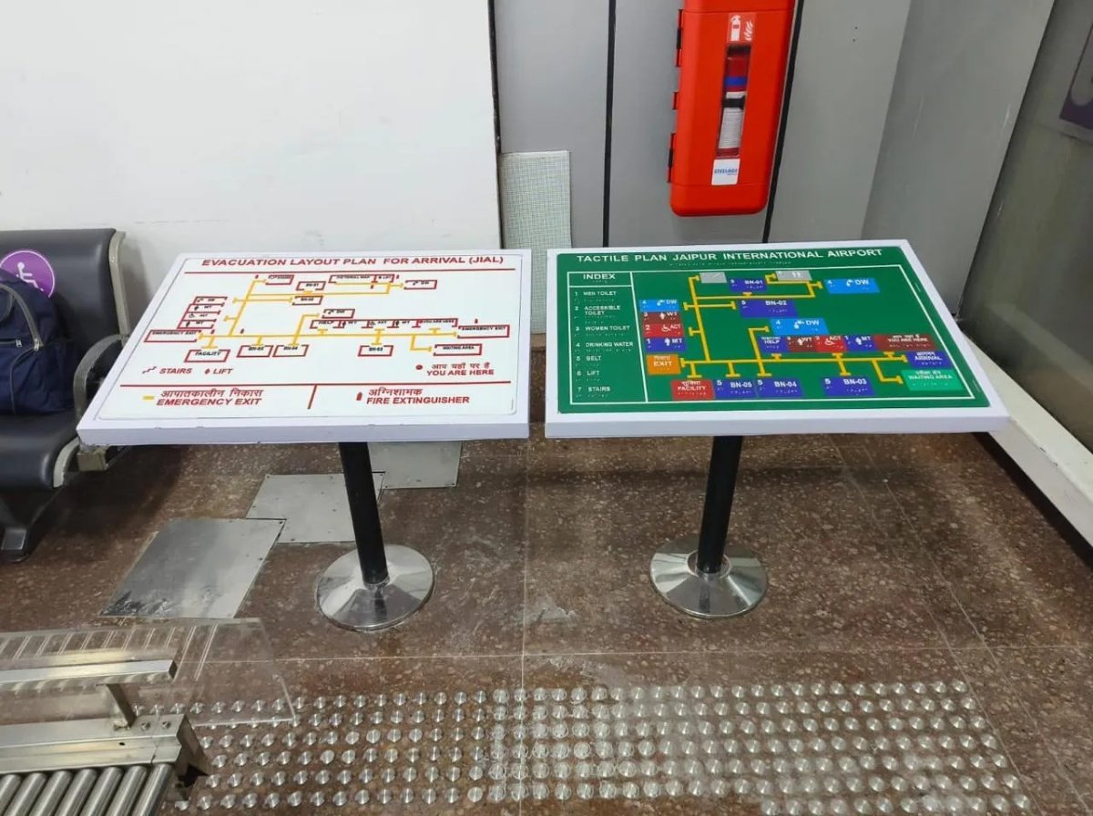
That is why an Evacuation Map and Tactile Map working together is such a smart approach. A tactile evacuation map shows the escape routes, exits, assembly points, stairwells and fire safety equipment in raised and Braille form. Ideally, a person learns it during their first visit, long before there is any emergency. They know which way the nearest exit lies, what the alternative route is, and where to gather outside.
If you are responsible for a workplace, school, hotel, hospital or public venue, it is worth asking a simple question. Could a blind person in this building find their way out on their own? If the honest answer is "not really," a tactile evacuation map is one of the most practical fixes you can make.
Organisations like Be My Vision work in this space, creating accessible solutions such as the Evacuation Map and Tactile Map. If you want to explore options for your own premises, you can reach them at info@bemyvision.in or call +91 8114478908.
How Tactile Maps Are Made
It helps to understand the basic process, even if you are not a designer. It will make your conversations with a supplier far more productive.
Step 1: Gathering the layout
Everything starts with an accurate floor plan or site drawing. Designers need to know the real dimensions, the entrances and exits, the key rooms and any hazards or landmarks that people with vision loss will want to know about.
Step 2: Simplifying the information
This is the most important step, and the one where experience really shows. The designer removes clutter, picks which features matter, and chooses a consistent set of symbols. Too much detail makes the map unreadable by touch. Too little makes it useless.
Step 3: Choosing the right production method
There are a few common ways to produce a tactile map, and each has its strengths.
- Swell paper (microcapsule paper): The map is printed or drawn on special paper, then heated. The black ink areas rise up. It is cheap and quick, so it works well for handouts and school material.
- Thermoforming: A plastic sheet is moulded over a master plate. It is durable and good for producing multiple copies.
- Embossing and engraving: Raised features are pressed or cut into metal, acrylic or other rigid materials. These are great for permanent wall-mounted maps in public places.
- UV printing: Layers of clear raised ink are printed onto a surface, which allows colour and texture together. This suits maps designed for both low-vision and blind users.
- 3D printing: Ideal for scale models of buildings, campuses or terrain, where height and shape really matter.
Step 4: Adding Braille and large print
Labels are added in Braille, and usually in large, high-contrast print too, since many people with visual impairment still have some usable vision. Braille standards differ from one country to another, so it is worth making sure the correct Braille code is used for the audience.
Step 5: Testing with real users
This step gets skipped far too often. A map that looks great on a designer's screen might confuse people who actually read by touch. Testing with blind and low-vision users, ideally with the help of an orientation and mobility specialist, catches problems early.
Read Also: Why Is Nobody Talking About Portable Suitcase Ramps?
What Makes a Good Tactile Map?
After looking at many maps over the years, a few qualities keep separating the great ones from the frustrating ones.
Simplicity
Less really is more. Every extra line or symbol is something a finger has to decipher. Keep only what a person needs to travel through the space.
Consistency
Use the same symbol for the same thing, everywhere. If a raised triangle means stairs on one map, it should mean stairs on all your maps. A legend or key, in Braille and large print, should always be included.
Clear contrast between textures
People should be able to tell a dotted line from a solid line, and a rough area from a smooth one, without effort. If two textures feel similar, change one of them.
A sensible size and position
A tactile map should be reachable and comfortable to explore, typically on a table or on a wall at a height people can easily touch. A map that is too big forces awkward arm movements. One that is too small becomes crowded and hard to read.
A clear starting point
The best tactile maps include a "you are here" marker and an orientation cue, such as a raised arrow showing north or the direction of the entrance. Without this, even a well-made map can leave the reader unsure which way they are facing.
Durability
Public maps get touched constantly. Materials need to withstand years of handling, cleaning and weather if they are outdoors.
Modern Technology and the Future of Tactile Maps
Tactile maps are not standing still. Several developments are making them more useful.
Audio-tactile maps are a good example. These combine a raised map with sound, so when a person presses a spot, they hear a spoken description of that location. This helps people who are new to Braille, and it adds detail that would otherwise crowd the surface.
QR codes and NFC tags are also appearing on tactile maps, linking to audio guides or phone-based navigation. And in the research world, there are refreshable tactile displays that can change their raised pattern on demand, a bit like a dynamic Braille screen for graphics. They are still expensive, but prices are slowly coming down.
Still, it's worth saying this clearly: technology works best alongside traditional tactile maps, not in place of them. Phones run out of battery and signals drop. A well-made physical map is always there, always working.
Standards and Guidelines to Keep in Mind
Accessibility rules vary between countries, but many regions have standards covering tactile signage, Braille and wayfinding. In the United States, the ADA sets requirements for signage and accessible design. The UK, Australia, Canada and many European countries have their own building accessibility codes. There is also an international standard, ISO 19028, that covers the design of tactile guide maps.
If you are planning a project, check the rules that apply in your region and speak with an experienced accessibility consultant. Standards change over time, so make sure you are working from the current version.
Common Mistakes to Avoid
A few pitfalls show up again and again.
- Putting too much information on a single map
- Placing the map somewhere that is hard to find without sight
- Forgetting to include a tactile path or guide leading people to the map in the first place
- Using Braille labels that are too small, too close together or placed over textured areas
- Skipping user testing
- Installing the map once and never updating it after the building layout changes
That second point is worth a second look. A tactile map is only useful if the person can find it. Many venues combine tactile ground indicators or a guiding line with the map location, so a visitor can follow the path straight to it.
Practical Tips for Organisations Planning a Tactile Map
If you manage a building or run an organisation, here is a simple way to start.
- Walk your space with accessibility in mind. Note the key decision points: entrances, lifts, stairs, washrooms, exits.
- Talk to people with visual impairments. Ask what information would actually help them. Their answers will often surprise you.
- Decide what type of map suits each location. A permanent wall plate at the entrance, a portable version for events, and a tactile evacuation plan are all different needs.
- Work with an experienced provider. Look for people who have produced real projects and who are happy to share examples.
- Plan for maintenance. Layouts change. Set a reminder to review your maps whenever you renovate or reorganise.
If you would like to discuss an Evacuation Map and Tactile Map for your own premises, the team at Be My Vision can be contacted at info@bemyvision.in or by phone on +91 8114478908.
Conclusion
Tactile maps are one of those rare accessibility tools that are simple, affordable compared with many alternatives, and powerful in everyday life. They give people with visual impairment something that is easy for sighted people to take for granted: an understanding of the space around them, and the freedom to move through it on their own terms.
Whether it is a campus map in a school, a station layout in a metro, or an emergency exit plan in an office, the principle stays the same. Information should be available to everyone, in a form they can use. Combining a thoughtful Evacuation Map and Tactile Map is a practical way to do that while also improving safety for everyone in the building.
If you manage a public space and haven't yet thought about this, now is a good time to start. Small steps, like one well-designed tactile map at your main entrance, can open up a place to hundreds of people who might otherwise feel shut out.
Frequently Asked Questions (FAQs)
- What is a tactile map, and who is it for?
A tactile map is a map that can be read by touch, using raised lines, textures, symbols and Braille. It is mainly designed for people who are blind or have low vision, though others, such as older adults and people with certain cognitive differences, can find them helpful too.
- Do people with visual impairment need to know Braille to use a tactile map?
Not always. Many tactile maps also include large-print, high-contrast labels, and some use audio features. Braille is important for those who read it, but the raised shapes and textures themselves carry a lot of the meaning.
- What is the difference between a tactile map and an evacuation map?
A tactile map shows the general layout of a space in a touchable form. An evacuation map focuses on emergency exits, escape routes and assembly points. A tactile evacuation map combines both ideas so that people with visual impairment can learn escape routes by touch before an emergency happens.
- Where should a tactile map be placed in a building?
Usually near the main entrance, reception or other key decision points, at a height and position that is easy to reach. It should be connected to the entrance by a guiding line or tactile path, so people can find it without assistance.
- What materials are used to make tactile maps?
Common options include swell paper, thermoformed plastic, embossed or engraved metal and acrylic, UV-printed raised surfaces and 3D-printed models. The best choice depends on how long the map must last, where it will be placed and how many copies you need.
- How often should tactile maps be updated?
Whenever the layout changes, such as after renovations, room reassignments or changes to exit routes. Even without major changes, it is wise to review maps once a year to check for wear and accuracy.
- Are tactile maps required by law?
It depends on the country and the type of building. Many regions have accessibility regulations covering tactile signage and wayfinding, though the exact rules differ. Check your local building codes and speak with an accessibility specialist to be sure you meet current requirements.
- How can I get a tactile map or evacuation map made for my organisation?
You can work with a specialist provider that understands tactile design and accessibility standards. For an Evacuation Map and Tactile Map, you can contact Be My Vision at info@bemyvision.in or call +91 8114478908 to discuss your requirements.
Tactile Maps: Improving Accessibility for People with Visual Impairment
Think about the last time you walked into an unfamiliar building. A hospital, an airport, maybe a university campus. You probably glanced at a directory, spotted a sign or two, and figured out where to go within a minute. Now imagine doing the same thing without being able to see any of it.
That is the daily reality for millions of people. According to the World Health Organization, at least 2.2 billion people around the world live with some form of vision impairment. For many of them, the real challenge is not walking itself. It is knowing what is around them, where the exits are, and how one space connects to another.
This is exactly where tactile maps step in. They are simple in concept, but they can change how independently a person moves through the world. In this article, I want to walk you through what tactile maps are, how they work, where they matter most, and what to keep in mind if you are planning one for your own building or organisation.
What Is a Tactile Map?
A tactile map is a map you can read with your fingers. Instead of relying on colour and printed labels, it uses raised lines, different textures, shapes and Braille to show the layout of a place.
A thick raised line might be a corridor. A dotted line might be a path or a boundary. A small rough square could mark a staircase, while a smooth circle could show a lift. Braille labels, and often large high-contrast print as well, tell the reader what each symbol means.
You can find tactile maps in all sorts of formats. Some are printed on special paper that puffs up when heated. Some are embossed on metal or plastic plates and fixed to walls. Others are 3D-printed models of entire buildings or neighbourhoods. The idea behind all of them is the same: turn visual information into something you can feel.
Why a tactile map is not just a "normal map with Braille"
This is a mistake I see quite often. People take a regular floor plan, slap some Braille labels on it, and call it accessible. Unfortunately, that rarely works.
A standard map is packed with detail, because eyes can scan hundreds of items at once. Fingers can't. Touch is slower and more sequential, so a good tactile map has to be simplified on purpose. Fewer symbols, cleaner lines, more space between elements. The designer has to decide what really matters and leave the rest out.
A Quick Look at How Tactile Maps Came About
Touch-based maps are not a new idea. Educators for the blind were experimenting with raised-line drawings and carved wooden maps as far back as the 1800s, mostly for teaching geography in schools. For a long time they were handmade, which meant they were slow to produce and expensive.
Things began to shift in the second half of the twentieth century. Thermoform plastic, then swell paper, then digital embossing and eventually 3D printing made it much easier to produce accurate maps in decent numbers. Today, a designer can take a CAD floor plan, simplify it in software and have a finished tactile map ready in a few days.
Why Tactile Maps Matter for People with Visual Impairment
Let's be honest about something. Many public spaces were designed by people who can see, for people who can see. Even when a building has Braille signs on the doors, those signs only help once you have already found the door.
What a tactile map offers is something bigger: a mental picture of the whole space before you start moving through it.
It builds independence and confidence
When someone can explore a map with their hands and understand the layout in advance, they don't have to ask a stranger for help at every corner. They can plan a route, remember landmarks and travel with far less stress. A lot of blind and low-vision people say that the freedom to move without depending on others is worth more than any gadget.
It supports safer travel
Knowing where the stairs, ramps, crossings and hazards are lowers the risk of accidents. Knowing where the nearest exit is can matter even more in an emergency, and I will come back to that shortly.
It is useful for more people than you might think
Tactile maps are designed for blind and low-vision users, but others benefit too. People with cognitive differences, older adults who are losing their sight gradually, and even sighted visitors in a dark or smoke-filled space can find them handy. Good accessibility design tends to work like that. It helps the person it was built for, and quietly helps everyone else.
Where You Will Find Tactile Maps in Real Life
Once you start looking, you notice them in more places than you would expect.
Public transport hubs
Metro stations, railway terminals and airports are confusing for almost everyone. A tactile station map near the entrance can show platforms, ticket counters, lifts and exits. Some cities have also added tactile route maps at bus stops and on station walls.
Hospitals and healthcare centres
People visiting hospitals are often anxious already. Add a sprawling building with multiple wings and the stress goes up. A tactile layout of the reception area, departments and washrooms makes a real difference here.
Schools, colleges and universities
Students with visual impairments need to learn their way around campus just like anybody else. Tactile campus maps, along with classroom diagrams and science illustrations, help them take part fully rather than waiting for someone to guide them.
Museums, parks and tourist spots
More museums now offer touchable models of sculptures, buildings and floor plans. Public parks and heritage sites are catching up as well. For a blind traveller visiting from another country, a tactile map at the entrance can turn an uncertain visit into an enjoyable one.
Offices, malls and public buildings
Shopping centres and corporate buildings can be maze-like. A tactile directory at the entrance gives visitors and employees with vision loss a way to orient themselves without help.
Evacuation Map and Tactile Map: A Safety Combination Worth Taking Seriously
This is the part that many building owners overlook. When we talk about accessibility, we usually think about everyday navigation. But what happens when the fire alarm goes off?
A standard evacuation plan is a coloured diagram on the wall, with arrows pointing to exits. For a person who cannot see it, that plan might as well not exist. In a stressful moment, relying on someone else to guide them is not a safe strategy. People panic, corridors fill up and nobody has time to explain.
That is why an Evacuation Map and Tactile Map working together is such a smart approach. A tactile evacuation map shows the escape routes, exits, assembly points, stairwells and fire safety equipment in raised and Braille form. Ideally, a person learns it during their first visit, long before there is any emergency. They know which way the nearest exit lies, what the alternative route is, and where to gather outside.
If you are responsible for a workplace, school, hotel, hospital or public venue, it is worth asking a simple question. Could a blind person in this building find their way out on their own? If the honest answer is "not really," a tactile evacuation map is one of the most practical fixes you can make.
Organisations like Be My Vision work in this space, creating accessible solutions such as the Evacuation Map and Tactile Map. If you want to explore options for your own premises, you can reach them at info@bemyvision.in or call +91 8114478908.
How Tactile Maps Are Made
It helps to understand the basic process, even if you are not a designer. It will make your conversations with a supplier far more productive.
Step 1: Gathering the layout
Everything starts with an accurate floor plan or site drawing. Designers need to know the real dimensions, the entrances and exits, the key rooms and any hazards or landmarks that people with vision loss will want to know about.
Step 2: Simplifying the information
This is the most important step, and the one where experience really shows. The designer removes clutter, picks which features matter, and chooses a consistent set of symbols. Too much detail makes the map unreadable by touch. Too little makes it useless.
Step 3: Choosing the right production method
There are a few common ways to produce a tactile map, and each has its strengths.
- Swell paper (microcapsule paper): The map is printed or drawn on special paper, then heated. The black ink areas rise up. It is cheap and quick, so it works well for handouts and school material.
- Thermoforming: A plastic sheet is moulded over a master plate. It is durable and good for producing multiple copies.
- Embossing and engraving: Raised features are pressed or cut into metal, acrylic or other rigid materials. These are great for permanent wall-mounted maps in public places.
- UV printing: Layers of clear raised ink are printed onto a surface, which allows colour and texture together. This suits maps designed for both low-vision and blind users.
- 3D printing: Ideal for scale models of buildings, campuses or terrain, where height and shape really matter.
Step 4: Adding Braille and large print
Labels are added in Braille, and usually in large, high-contrast print too, since many people with visual impairment still have some usable vision. Braille standards differ from one country to another, so it is worth making sure the correct Braille code is used for the audience.
Step 5: Testing with real users
This step gets skipped far too often. A map that looks great on a designer's screen might confuse people who actually read by touch. Testing with blind and low-vision users, ideally with the help of an orientation and mobility specialist, catches problems early.
What Makes a Good Tactile Map?
After looking at many maps over the years, a few qualities keep separating the great ones from the frustrating ones.
Simplicity
Less really is more. Every extra line or symbol is something a finger has to decipher. Keep only what a person needs to travel through the space.
Consistency
Use the same symbol for the same thing, everywhere. If a raised triangle means stairs on one map, it should mean stairs on all your maps. A legend or key, in Braille and large print, should always be included.
Clear contrast between textures
People should be able to tell a dotted line from a solid line, and a rough area from a smooth one, without effort. If two textures feel similar, change one of them.
A sensible size and position
A tactile map should be reachable and comfortable to explore, typically on a table or on a wall at a height people can easily touch. A map that is too big forces awkward arm movements. One that is too small becomes crowded and hard to read.
A clear starting point
The best tactile maps include a "you are here" marker and an orientation cue, such as a raised arrow showing north or the direction of the entrance. Without this, even a well-made map can leave the reader unsure which way they are facing.
Durability
Public maps get touched constantly. Materials need to withstand years of handling, cleaning and weather if they are outdoors.
Modern Technology and the Future of Tactile Maps
Tactile maps are not standing still. Several developments are making them more useful.
Audio-tactile maps are a good example. These combine a raised map with sound, so when a person presses a spot, they hear a spoken description of that location. This helps people who are new to Braille, and it adds detail that would otherwise crowd the surface.
QR codes and NFC tags are also appearing on tactile maps, linking to audio guides or phone-based navigation. And in the research world, there are refreshable tactile displays that can change their raised pattern on demand, a bit like a dynamic Braille screen for graphics. They are still expensive, but prices are slowly coming down.
Still, it's worth saying this clearly: technology works best alongside traditional tactile maps, not in place of them. Phones run out of battery and signals drop. A well-made physical map is always there, always working.
Standards and Guidelines to Keep in Mind
Accessibility rules vary between countries, but many regions have standards covering tactile signage, Braille and wayfinding. In the United States, the ADA sets requirements for signage and accessible design. The UK, Australia, Canada and many European countries have their own building accessibility codes. There is also an international standard, ISO 19028, that covers the design of tactile guide maps.
If you are planning a project, check the rules that apply in your region and speak with an experienced accessibility consultant. Standards change over time, so make sure you are working from the current version.
Common Mistakes to Avoid
A few pitfalls show up again and again.
- Putting too much information on a single map
- Placing the map somewhere that is hard to find without sight
- Forgetting to include a tactile path or guide leading people to the map in the first place
- Using Braille labels that are too small, too close together or placed over textured areas
- Skipping user testing
- Installing the map once and never updating it after the building layout changes
That second point is worth a second look. A tactile map is only useful if the person can find it. Many venues combine tactile ground indicators or a guiding line with the map location, so a visitor can follow the path straight to it.
Practical Tips for Organisations Planning a Tactile Map
If you manage a building or run an organisation, here is a simple way to start.
- Walk your space with accessibility in mind. Note the key decision points: entrances, lifts, stairs, washrooms, exits.
- Talk to people with visual impairments. Ask what information would actually help them. Their answers will often surprise you.
- Decide what type of map suits each location. A permanent wall plate at the entrance, a portable version for events, and a tactile evacuation plan are all different needs.
- Work with an experienced provider. Look for people who have produced real projects and who are happy to share examples.
- Plan for maintenance. Layouts change. Set a reminder to review your maps whenever you renovate or reorganise.
If you would like to discuss an Evacuation Map and Tactile Map for your own premises, the team at Be My Vision can be contacted at info@bemyvision.in or by phone on +91 8114478908.
Conclusion
Tactile maps are one of those rare accessibility tools that are simple, affordable compared with many alternatives, and powerful in everyday life. They give people with visual impairment something that is easy for sighted people to take for granted: an understanding of the space around them, and the freedom to move through it on their own terms.
Whether it is a campus map in a school, a station layout in a metro, or an emergency exit plan in an office, the principle stays the same. Information should be available to everyone, in a form they can use. Combining a thoughtful Evacuation Map and Tactile Map is a practical way to do that while also improving safety for everyone in the building.
If you manage a public space and haven't yet thought about this, now is a good time to start. Small steps, like one well-designed tactile map at your main entrance, can open up a place to hundreds of people who might otherwise feel shut out.
Frequently Asked Questions (FAQs)
- What is a tactile map, and who is it for?
A tactile map is a map that can be read by touch, using raised lines, textures, symbols and Braille. It is mainly designed for people who are blind or have low vision, though others, such as older adults and people with certain cognitive differences, can find them helpful too.
- Do people with visual impairment need to know Braille to use a tactile map?
Not always. Many tactile maps also include large-print, high-contrast labels, and some use audio features. Braille is important for those who read it, but the raised shapes and textures themselves carry a lot of the meaning.
- What is the difference between a tactile map and an evacuation map?
A tactile map shows the general layout of a space in a touchable form. An evacuation map focuses on emergency exits, escape routes and assembly points. A tactile evacuation map combines both ideas so that people with visual impairment can learn escape routes by touch before an emergency happens.
- Where should a tactile map be placed in a building?
Usually near the main entrance, reception or other key decision points, at a height and position that is easy to reach. It should be connected to the entrance by a guiding line or tactile path, so people can find it without assistance.
- What materials are used to make tactile maps?
Common options include swell paper, thermoformed plastic, embossed or engraved metal and acrylic, UV-printed raised surfaces and 3D-printed models. The best choice depends on how long the map must last, where it will be placed and how many copies you need.
- How often should tactile maps be updated?
Whenever the layout changes, such as after renovations, room reassignments or changes to exit routes. Even without major changes, it is wise to review maps once a year to check for wear and accuracy.
- Are tactile maps required by law?
It depends on the country and the type of building. Many regions have accessibility regulations covering tactile signage and wayfinding, though the exact rules differ. Check your local building codes and speak with an accessibility specialist to be sure you meet current requirements.
- How can I get a tactile map or evacuation map made for my organisation?
You can work with a specialist provider that understands tactile design and accessibility standards. For an Evacuation Map and Tactile Map, you can contact Be My Vision at info@bemyvision.in or call +91 8114478908 to discuss your requirements.